
Good coffee starts the day with a different feeling.
A story that begins in a cup
We imagined Peado not just as a place that serves good coffee, but as a ritual that makes room for itself in the day. From the aroma of the coffee to the first sip, from the warmth of the space to the bonds formed with people, we made every detail part of the same feeling. We took the idea of “Good coffee, brighter days” beyond a slogan and turned it into a simple, sincere brand experience you will want to come back to.
Logo and typography: A simple signature
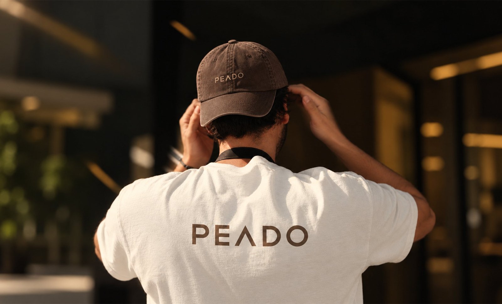
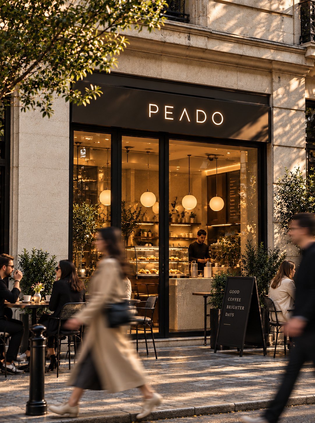
The Peado logotype is built on a geometric, airy sans-serif. By removing the crossbar from the "A", we gave the brand a distinctive, minimal character. Thanks to its simplicity, the logo stays sharp and legible at every size, from the storefront sign to the cup lid, from caps to packaging.
Color and texture: Leaf, bean and light
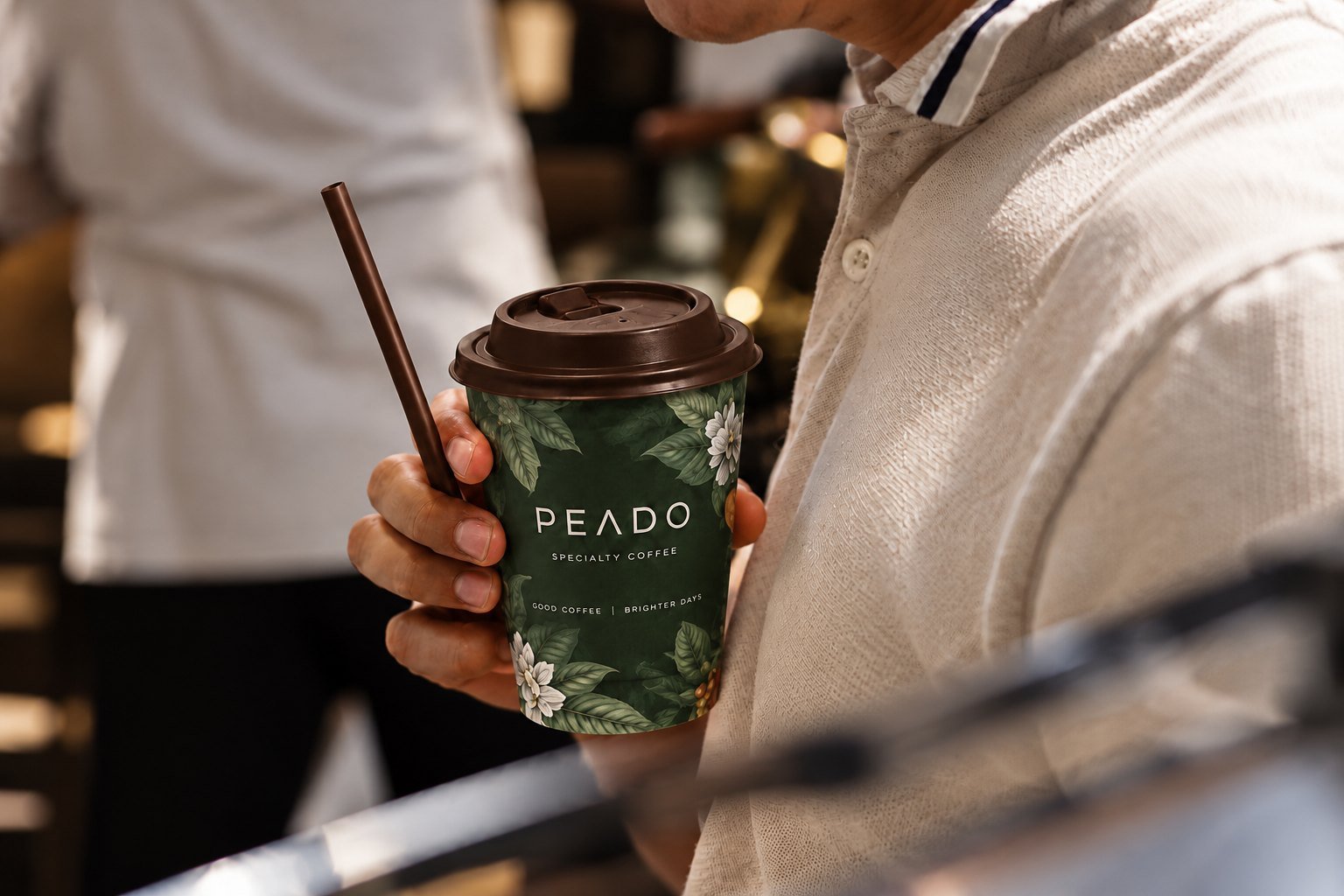
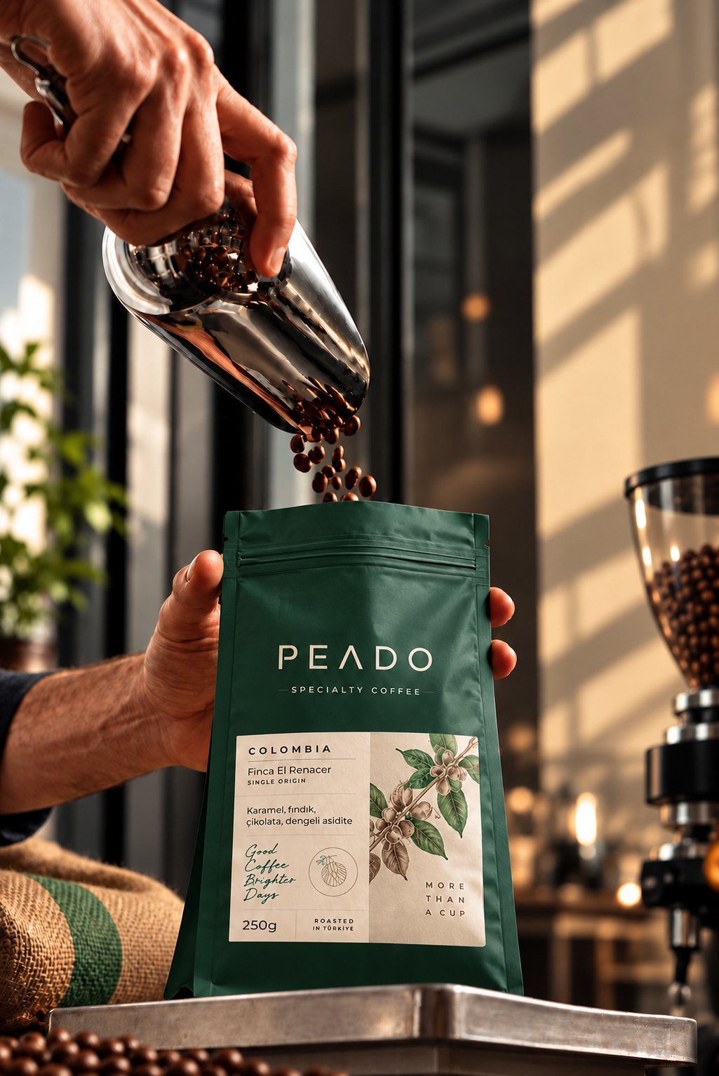
We drew the palette from coffee itself: a deep green from the leaves of the coffee plant, the browns of roasted beans and a warm beige that recalls morning light. The botanical coffee flower illustrations on the packaging and cups add a sense of craft and origin to the product.
Packaging and touchpoints: The same warmth everywhere
On the coffee bags, we structured origin, farm and tasting notes in a clear hierarchy, so customers understand the product at a glance. The storefront, A-board, take-away cups and staff uniforms all speak the same language. Messages like "Coffee, good people, good conversations, always" turn the brand into a meeting point rather than just a coffee shop.
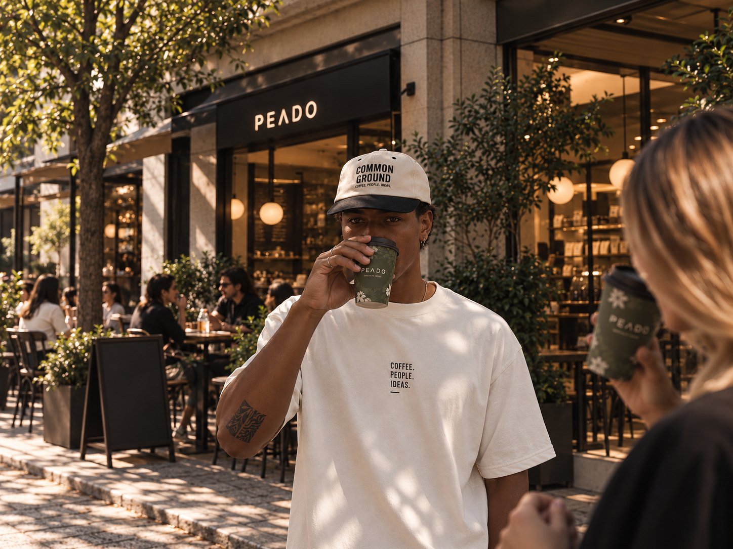
It starts with coffee and finds meaning with people.
We approached Peado’s identity not only as a visible design system, but as a cohesive whole you can feel. Every touchpoint, from the storefront to the take-away cup, from coffee bags to staff uniforms, carries the same warmth. Beyond coffee, Peado becomes a meeting point where people drop by, stay, talk and want to return.