
A brand that carries the rhythm of the sea.

An identity set on a course of elegance
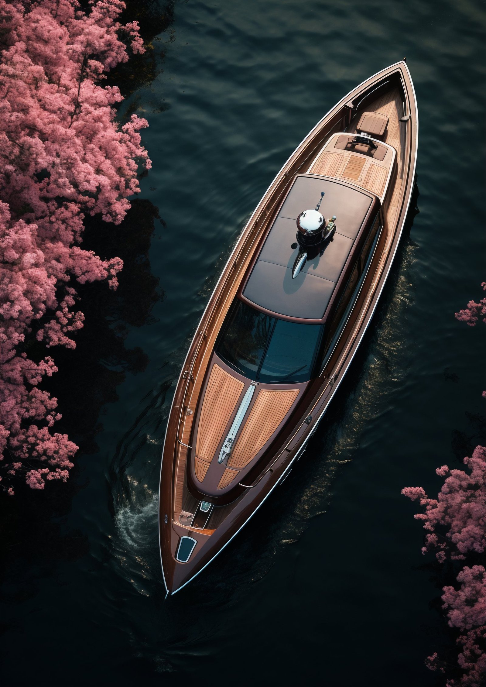
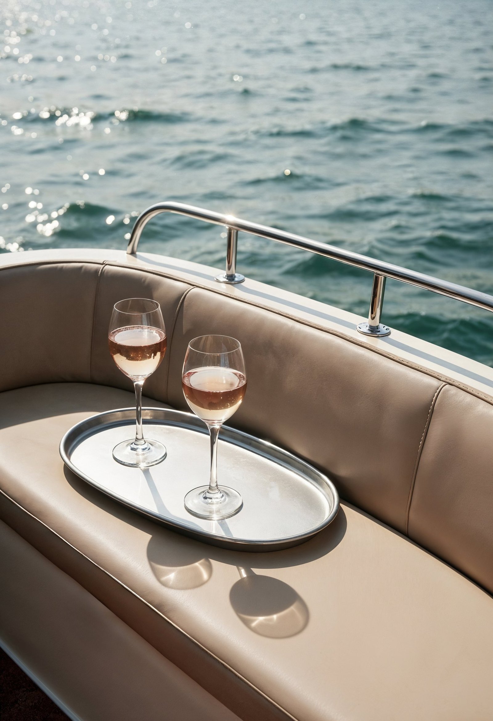
For Koçmare Yacht, we created more than a logo: a cohesive brand language you can feel from deck to cabin. We brought the calm of the open sea, the warmth of wood and the confidence of fine details together in a single identity.

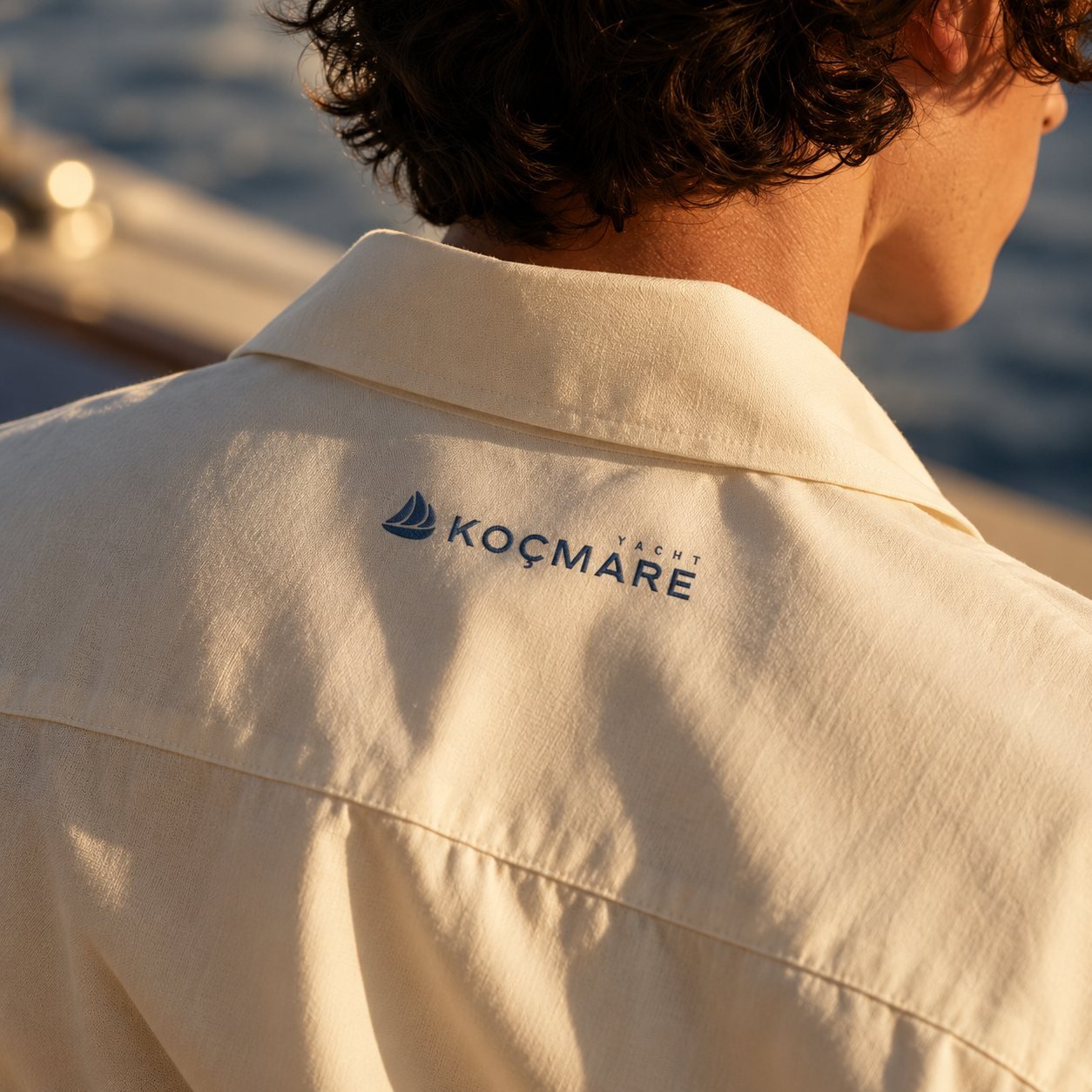
Logo: A mark that catches the wind
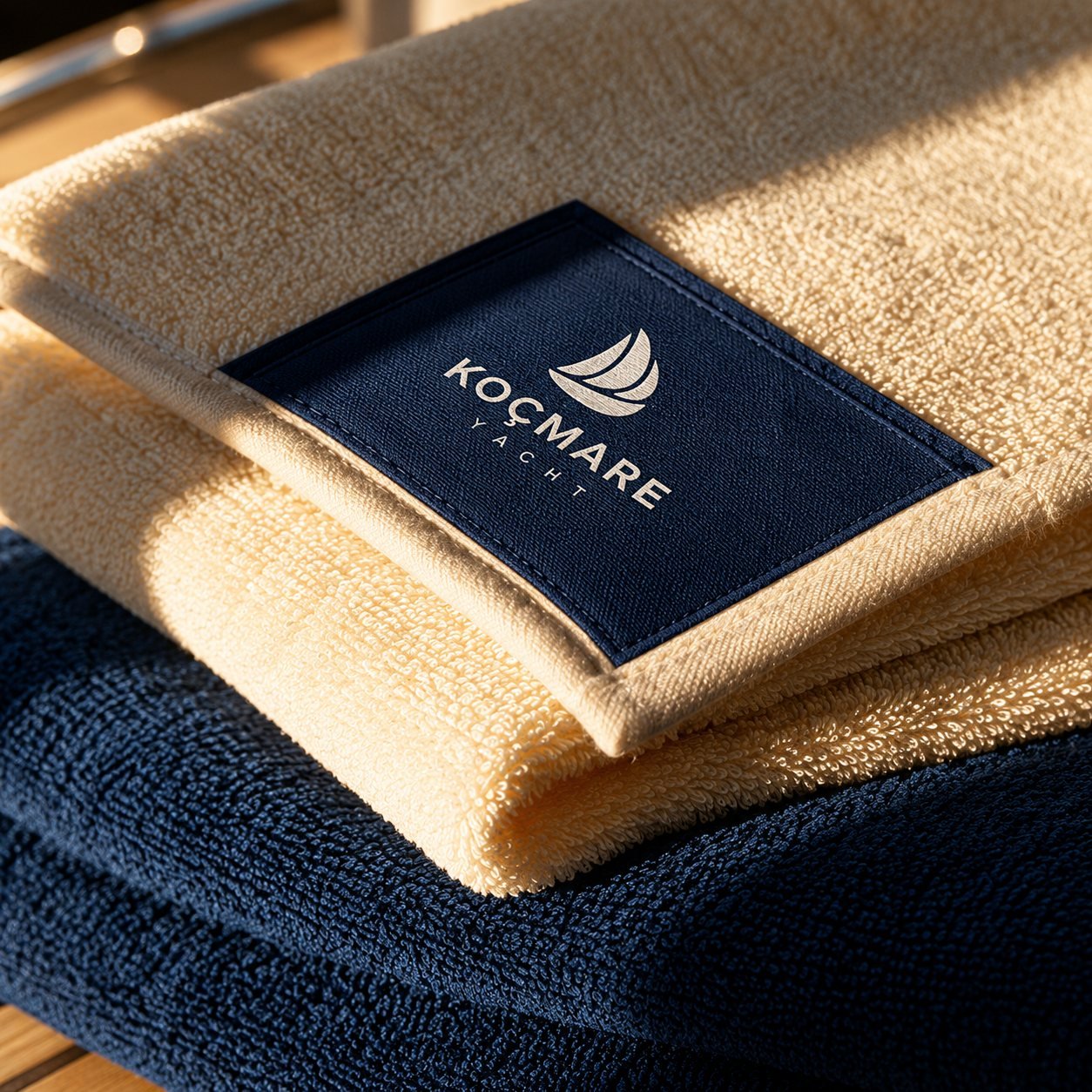
We designed the symbol from the movement of a sail filling with wind, bringing flow, freedom and a sense of direction together in a simple form. The “Ç” in the logotype keeps its local identity, while the fine “YACHT” lettering gives the brand a more refined stance.
Color and texture: Navy and sand
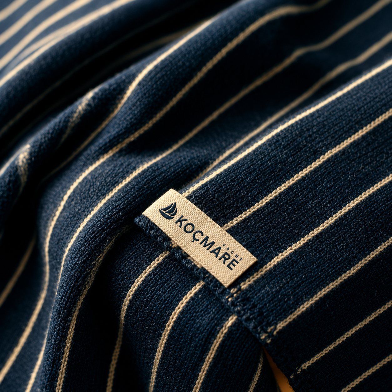
The palette brings together the deep navy of the sea and the warm tones of sand and wood. Striped fabrics and textured surfaces carry classic nautical aesthetics into a more contemporary, timeless language.
Experience: The same care from deck to cabin
From the sign on the cabin door to the towel label, from crew shirts to fabric details, we designed every touchpoint in the same brand language. Koçmare keeps the same feeling in every detail.
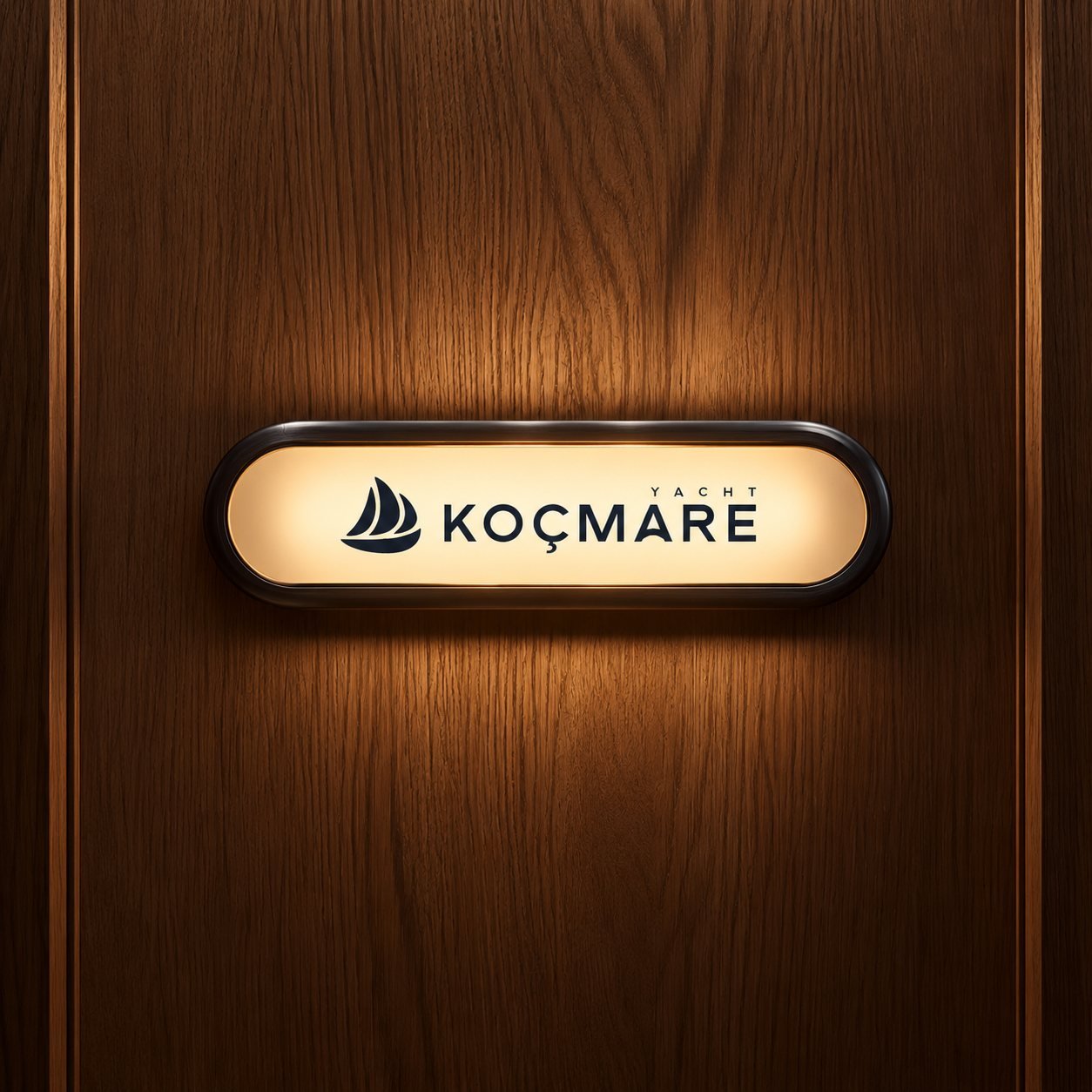
The same horizon in every detail.
Koçmare’s identity carries the same calm elegance across every touchpoint, from the cabin sign to the towels, from crew uniforms to fabric textures. The brand represents not just a voyage, but a sea experience people remember.